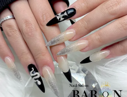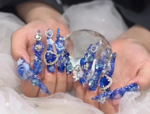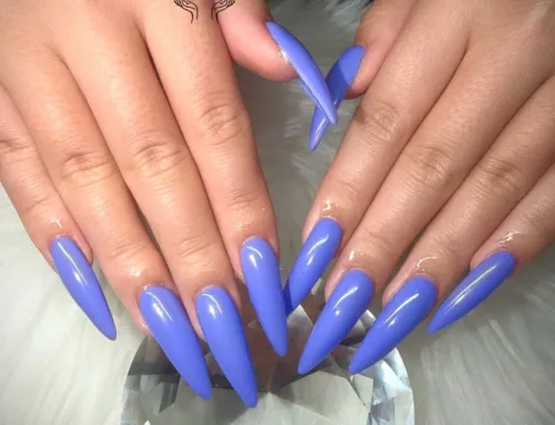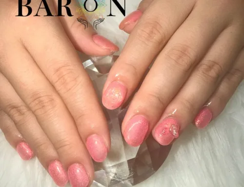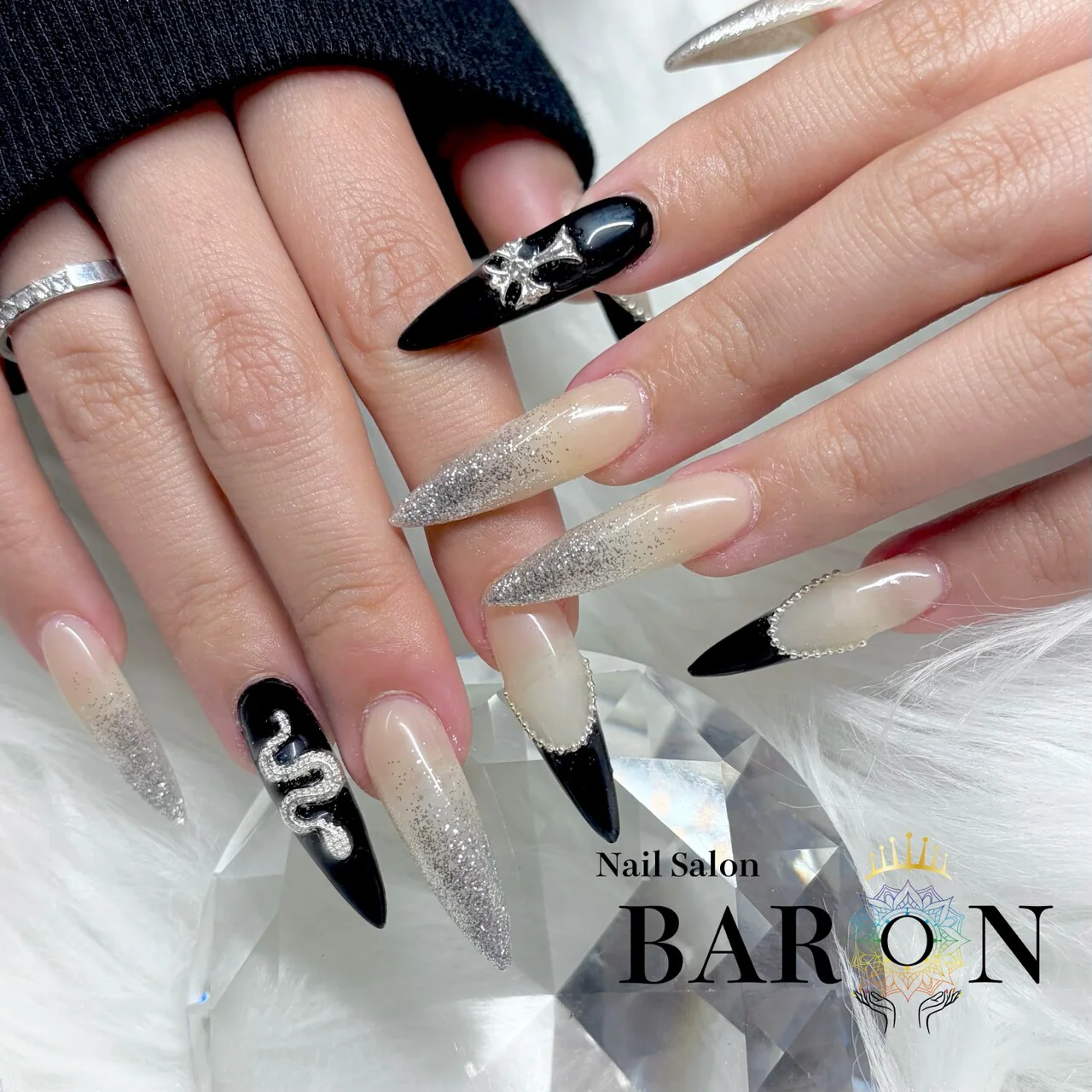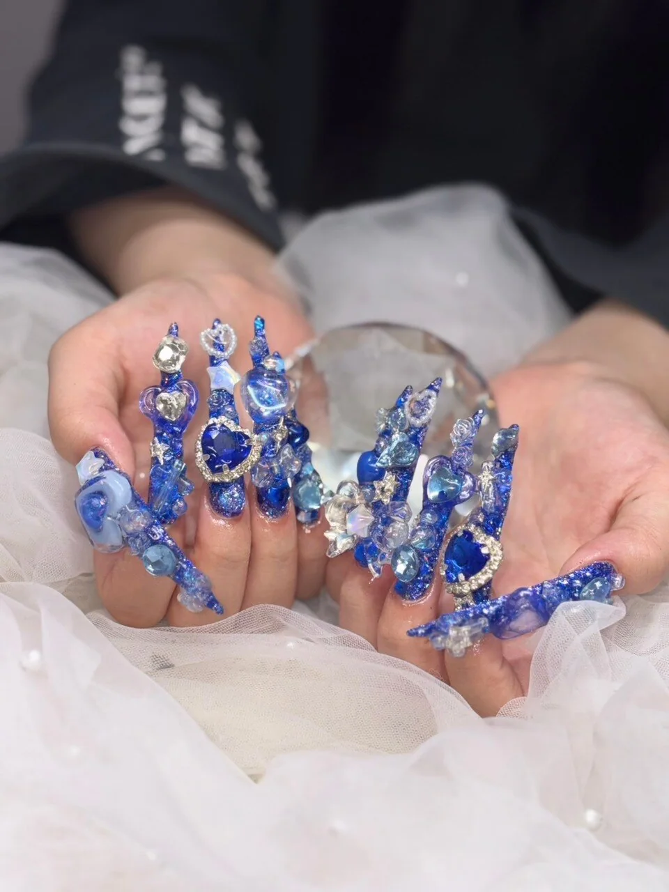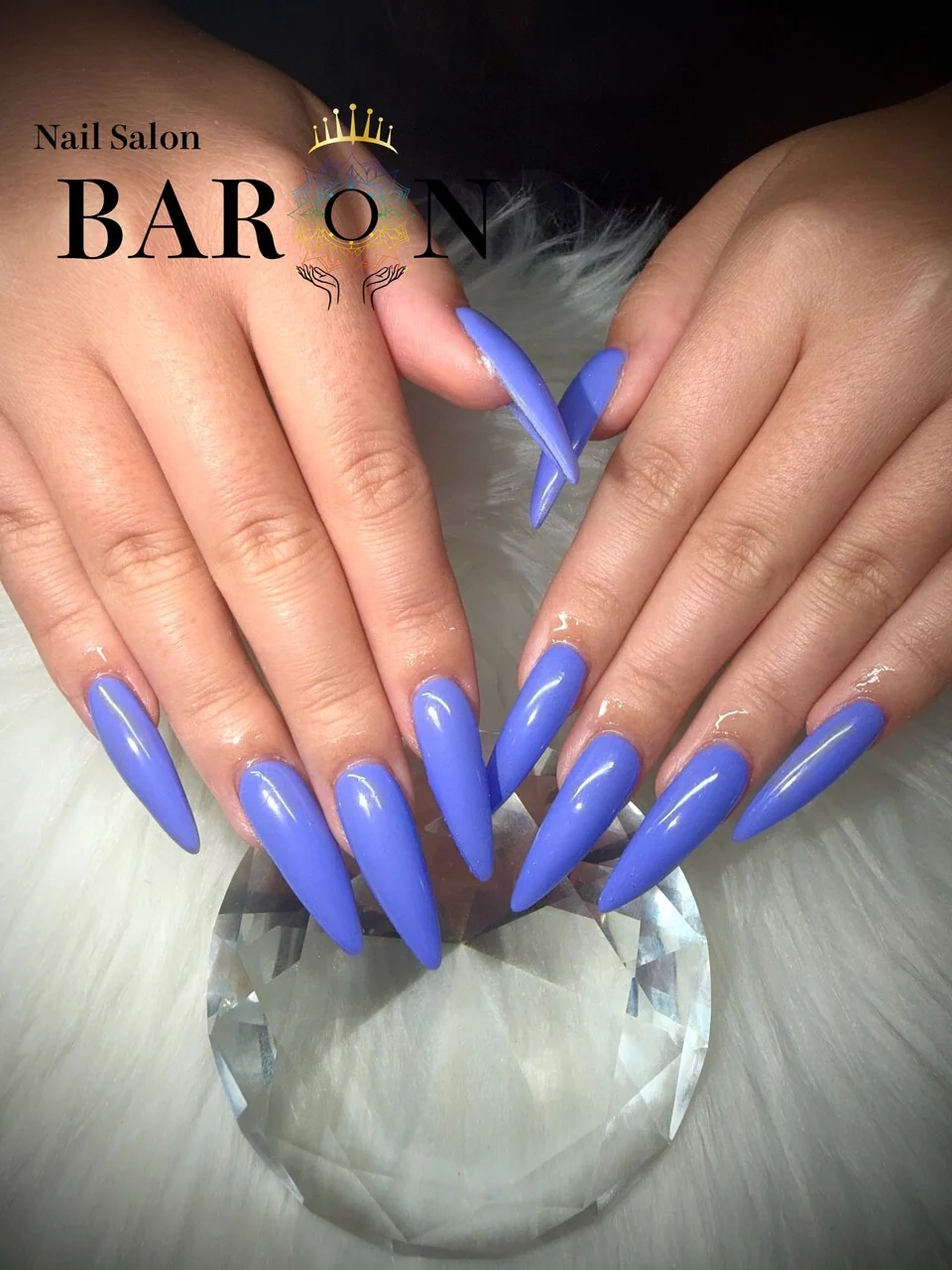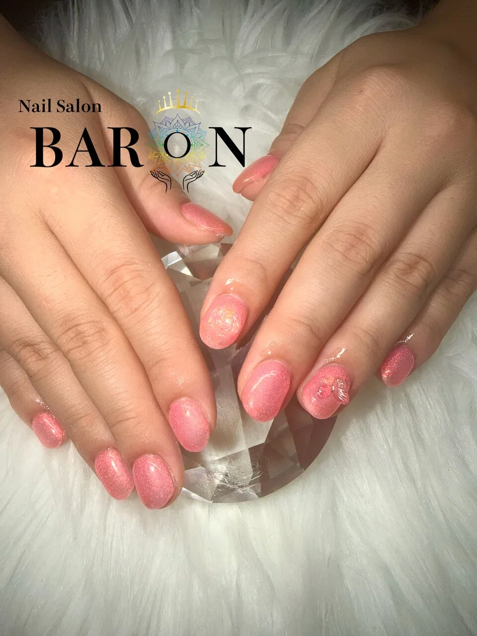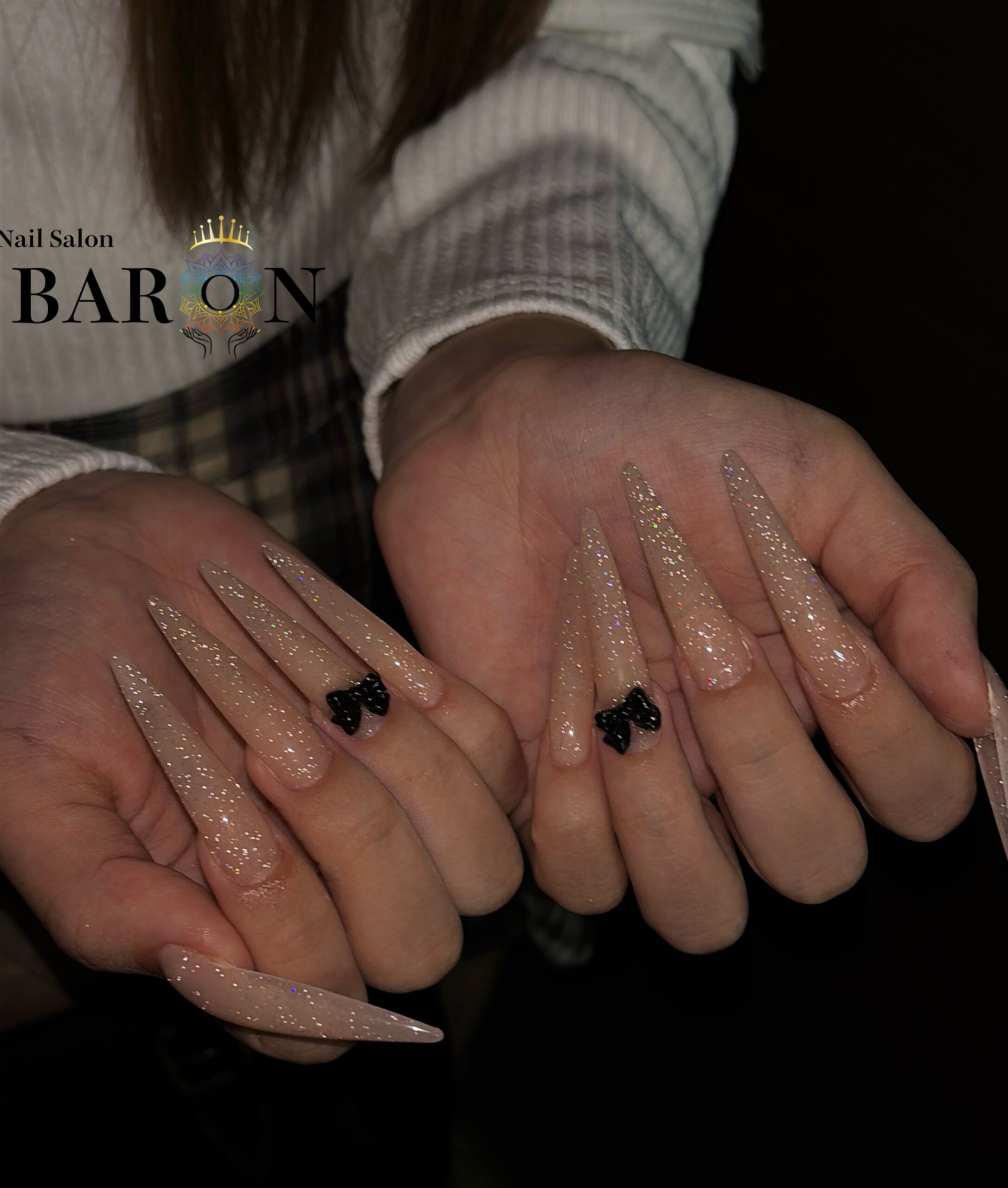
The color you like may include an effect you have not named
You save a photo of soft pink nails, then notice that the closest color sample seems quite different. The reference may combine several things: the shade itself, how much of the nail shows through, reflections and the lighting in the photo. Separating those elements makes it easier to explain what you actually want.
This guide is a way to discuss appearance, not a formula for reproducing a screenshot. Start with BARON’s English salon guide for salon information, and use the questions below when narrowing down your color choices.
Separate color family from coverage
Color family describes the general direction: pink, beige, red, blue or another hue. Coverage describes how much the color hides what is underneath. Two pink references may feel very different because one is translucent and the other forms a more solid-looking block of color.
- Sheer: some of the underlying nail remains visible. Useful language includes “translucent” and “I want some natural nail to show.”
- Opaque: the overall appearance is more covered and solid. Try “I want a solid-looking color with little of the underlying nail visible.”
- Between the two: say which feature you want to retain, such as a soft look with less visible variation underneath.
Words such as “milky,” “jelly” and “nude” can mean different things to different people. Pair the word with a photo and a sentence about coverage rather than assuming it names one precise result.
Look for clues in the reference
Zoom in on the nail surface. Can you see a difference between the nail bed and the tip? Does the color seem more transparent near an edge? Is there a strong white reflection obscuring part of the surface? These observations give you questions to ask, but they do not prove which products or technique were used.
Compare another image or angle if one is available. If the same set looks beige in one photo and pink in another, mark the image closest to your preference. You can say, “I like the cooler pink in this picture, even if the actual set was photographed differently.” That keeps the request focused on the appearance you want.
Account for the screen and the lighting
A phone display and a photograph are not physical color samples. Brightness settings, image edits and the light used for the photo can change how a color appears. A warm indoor image may emphasize a different aspect of the color from a cooler image.
When showing a reference, mention any display filter you know is active and whether the image looks representative to you. If a subtle shade difference matters, say so early. An in-person comparison of the available options is more useful than expecting an exact match to every screen view.
Ask what the sample represents
When reviewing a color sample, ask how it relates to the proposed set. Useful questions include:
- “Is this showing a sheer finish or fuller coverage?”
- “Would my underlying nail or extension affect the appearance?”
- “I like this shade, but can we discuss a less transparent option?”
- “Which available sample is closest to this soft, covered look?”
Do not prescribe a number of layers from a reference photo. The visible result depends on the chosen product and the proposed application, and adding more layers is not a universal way to turn one look into another. Explain the result you want and ask the artist which available option is appropriate.
Three ways to make a vague color request clearer
“I want natural pink”
Try: “I want a soft pink rather than beige. I like some translucency, but I do not want the tip to look strongly different from the rest.” This identifies both the hue preference and the coverage concern without naming an unverified product.
“I want white, but not too white”
Try: “I like a soft white appearance with some depth. Please show me the available options between transparent and solid-looking white.” You are asking for a comparison instead of relying on an ambiguous label.
“I want exactly this red”
Try: “The brighter red in this image is my priority. I want solid-looking coverage. Could we compare the closest available shades before choosing?” If an exact shade is essential, discuss that limit before committing to the design.
Confirm the visual priorities before application
Summarize the color in three parts: hue, coverage and the effect you most want to avoid. For example: “Cool pink, lightly translucent, without a strong beige impression.” This gives the artist a concise description to check against the reference and available options.
Browse real work on BARON’s nail-design Instagram. Send your reference and color questions through official Instagram DM or LINE, naming your preferred location. Color and product availability should be confirmed for your appointment.